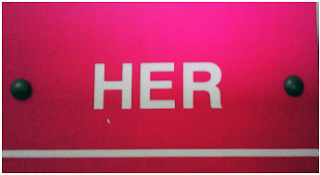
These days I have been observing a lot of signage.
This I thought was a little different, yet it looks very unhygienic.
I would never enter this place!
All have the same ICON style to it.
And then I turned to my college signage. In one word it was POOR.
(His was broken!)
His-Her are those signs where graphic can be much more creative while being precise. Jus take up a feature of a women, for "Her" and express it graphically! Work Done!
So these a jus some few things that I tried...The main focus is on IDEA rather than the presentation. Done in less than 4 hours.


Comments
Post a Comment